Early Spring: Refresh & Renew With Hues of Blue
- Tachic Hickman-Piazza
- Feb 27, 2018
- 10 min read

When 2018 first began, I must say I was definitely in the midst of a good winter sluggish state. The Gulf Coast was experiencing quite unusual, frigid temps with even several days of ice, sleet, and snow. While some southern states like Texas and Georgia do oftentimes experience real winter seasons, it's highly uncommon for those of us in Louisiana...in particular in New Orleans to experience such real wintry weather. I remember real winters as a child growing up in NOLA. But with global warming and such nowadays, I can't recall the last time New Orleans has had such a long or rather consistent run of frigid temps.
I, however was actually happy about the cold brisk air and the opportunity to actually utilize my fireplace more than just a few times during this winter season. My husband, as a native New Yorker living in the South was ecstatic to have a winter season that reminded him of home. We spent many days relaxing by the fireside, snuggled underneath the covers, sipping hot cocoa, eating hearty soups and comfort foods, and just enjoying the life of being house bums for as long as it would last.
Now at the end of February, the cold temps are gearing up to become a distant memory with warmer and sunny days finally ready to take over...well at least for those of us in the South. I know many of my northern and mid-west friends are still experiencing wintry weather at this very moment, with warmer days not quite near the horizon. However, yesterday in my neck of the woods - I witnessed the change of season with the first thin blanket of pollen, enveloping the exterior of my car. That indeed, was and is a for sure sign that Springtime is officially on its way.
But before we jump into photo reveals, (trust me I know ya'll are all ready for that), let's back track just a tad bit more...
Now ya'll know I am a fierce lover of all things BLUE!!! It is indeed my absolute favorite primary color. However, I've been living in a purple and ultraviolet world for the last several weeks. Earlier this year, or more so at the very end of last year, Pantone introduced their 2018 color of the year as Ultraviolet. I was pretty ecstatic about that announcement, considering I'd just finished designing my guest bedroom in early Fall of last year, where purple is the standout color in that particular space. So I definitely felt like I was either right on time with choosing purple as an accent color, or more so a bit ahead of the trend. I'd like to think it was more of the latter. 😉
Design Note: To view just the photos of my Guest Bedroom Design, please visit my Design Gallery or simply click here. To catch up on the written blogpost of my Guest Bedroom Reveal, click here.
In addition, the season of Carnival and Mardi Gras in New Orleans began immediately after the Christmas holidays were over. The season of Mardi Gras is ALL about the color purple as it is one of the main traditional colors of the festive season, with the other two colors being gold and green. The same week the Mardi Gras festivities all came to an end on Fat Tuesday, the highly anticipated film of the year, Black Panther, was released. While the film celebrates an array of beautiful African colors, purple is the royal color worn by Black Panther, King T'Challa himself.
Like I said, I have been living and breathing purple, OK!!! My social media feeds has been full of Mardi Gras purple, my guest bedroom shots of purple and even officially proclaiming that my husband and I are now moving to the land of purple, #WakandaForever after seeing the film Black Panther not once, but twice!!! With the intent of going to see it once more. Yes, that's just how GREAT the film is!!! If you haven't, GO SEE IT!!
But all that to the side. My first color love, Blue was sitting there like..."Look go ahead and be all infatuated with purple for the moment. But you and I both know where your heart truly lies and it's for damn sure not with purple. It's with me and all of my beautiful hues of blue!! So when you get your mind right and come to your senses, I'll be right here waiting for you and ready to accept you back with open arms. Just don't let the sh*t happen again! So bring your butt back on home and let's act like this purple infatuation never really happened, OK!"
So basically, Blue sat me down, got me together and reminded me to never put another color before her. It's ok for me to love and appreciate other colors, even play with them for a minute if need be. BUT, Blue must and will always reign supreme in my life. And, all other colors must know they can only reach side-chick status in my world. They really can't go much further beyond that...because Blue was, is and will always be BAE!
With that being said...Now let's get into me reconnecting this early Spring season with my first color love, BLUE!! 💙

Sources:
Interior Design & Styling By: Allured By Design
Photo Stills By: Stacy Marks Photography
Shooting Location: House Piazza
Makeup By: Javetta White
Hair By: Lashanda Taylor of Between The Shears
Wardrobe: Yellow Pants, Ivory Pom-Pom Sweater, Blue & White Handkerchief, and Denim Blazer - Banana Republic


LIVING ROOM REFRESH:
Most of you who've been following me for quite some time, if not since the very beginning are very familiar with my blue living room, or great room. I have two beautiful chenille upholstered indigo blue sofas, styled with an assortment of various hues of deep blue, gold and neutral toned toss pillows. While it's very rare that I change my toss pillows out entirely in my living area, I do tend to change the order of my pillows very frequently.
However, for Spring 2018 I decided to order two new additions to my toss pillow lineup. The two newbies actually made it's debut in #HousePiazza during the Christmas holidays, on my love seat. But for Spring, I've changed up the lineup moving the two new pillows from ZGallerie to my larger sofa. They each sit at both ends of my couch, while setting the tone for all pillows in between.


Design Tip: Never underestimate how just a quick change to your toss pillow lineup, or adding in just a couple of new ones can both update and refresh your space.

COFFEE TABLE REFRESH:
I change up the styling of my coffee table quite often, but rarely do I strip it down bare and start anew. Well last Summer, I purchased four absolutely gorgeous gold and white accents from one of my favorite local stores, Niche Modern Home...
Gold Ginger Jar
Gold & White Art Deco Vase
White Textured Vase
Gold & White Marble Tray
Originally, I had in mind to place the accents on my 2nd level hall way console. But for my early Spring look, they added such a refreshed and renewed look to my coffee table, as well as to my entire living room space.

I love these gold and white beauties so very much, that I actually debuted them right here on my blog for this past Christmas and holiday look as well. They've definitely moved around my house quite a bit since I purchased them last Summer. But I must say, I LOVE them centered on my coffee table amongst a sea of beautiful blues.


Design Tip: Blue and Gold pairs together soooooo very well!!! It's a very popular color combination and one that I highly recommend for anyone looking to add blue, as well as a metallic accent into their space. The addition of white to the mix definitely adds that light and airy feel making it an even more perfect combination and color palette for Spring.
CONSOLE STYLING REFRESH:
For my rustic console, which sits behind my larger sofa, I opted for a very clean, decluttered, and simple look.

For the Christmas holidays, this console was all about styling with glitter and all things shimmery and shiny. For Spring, it's all about reconnecting with my love for blue and allowing all of it's various hues, from the lightest to the darkest be center stage all throughout my living room space.


For a continuous look, I even chose book covers and spines that complimented my blue and gold theme. Of course it doesn't hurt at all that the books just so happen to be high-end fashion books as well, which are always a design favorite. Simply because fashion and design go hand in hand. And, for interest as well contrast, I introduced various metallics in this area to create a more mixed metal look.
KITCHEN TABLESCAPE & BREAKFAST/WINE BAR REFRESH:
One of the most fun looks I designed and created into my Spring refresh, was the introduction of a new kitchen table scape.

Crazy Fun Fact: Pottery Barn is one of my absolute favorite catalogues I look forward to collecting every single month. I'm obsessed with Designer, Monique Lhuillier and the gorgeous tablescapes she creates for PB catalogues. The photo below is my ode to her and how I'm always inspired by her fabulous photo shoots and tablescapes. To view her most recent Spring tablescape, click here.

As much as I LOVE re-styling and playing around with my toss pillows and finding amazing accents to place in my living room area...Surprisingly, I believe I had even more fun curating my kitchen table centerpiece and all of the dinnerware and tableware pieces for my Spring tablescape. I would've never thought that to be the case, but I truly enjoyed bringing this look together.
And, once again to keep a consistent flow, I extended the blue and gold from my living area to my kitchen nook as well..keeping that Spring refreshed and renewed with hues of blue look going. I mean seriously, could this be any more beautiful? I really LOVE how this tablescape came out!!


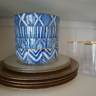
Also, because my breakfast and wine bar sits right behind my kitchen table, of course hues of blue had to be incorporated into this very visible area as well.

I brought in a much richer blue to my top shelf, added new blue and white bowls from World Market to my second shelf, and then really layered on the metallics all throughout each level.
This was a very inexpensive update, as most of the refresh items on my bar all came from either Home Goods or Cost Plus World Market.


ISLAND & COUNTER TOP REFRESH:
One of the things I love about my kitchen are the deep espresso cabinets. I love the contrast between dark and light woods and just dark and light tones in general. While I could've opted for lighter cabinets to compliment my kitchen nook area, which features light rustic woods and lightly distressed white, as you've seen in the above photos...I chose to create a more unique and amalgamated look with two different tones of wood.
As such, it's always imperative that the decor on my kitchen table compliments the styling atop of my island as well. Mainly because everything is all in one open area with visible sight lines from one room into the next...from my living room to my entire kitchen and breakfast bar area. So it's always, always important to maintain consistency in an open layout or floor plan.

So to bring everything altogether, I kept the blue color trend flowing onto my kitchen island as well. However, I'm a firm believer that every room should still have its own identity. So I went with different tableware and dinnerware atop of my island. In addition, I chose different, yet complimenting centerpieces.


And, of course I kept the floral train going as well because nothing says Spring quite like beautiful florals.
STAIRWELL GALLERY WALL:
Now at this point, not only have I re-confirmed and professed my love for blue all throughout my living and kitchen area, but to drive my point even further of just how much I missed blue and yearned for an even deeper connection...I created a gallery wall cascading along my stairwell, filled with abstract pieces all centered around the color blue.

One of the most spectacular pieces on my stairwell gallery wall, is this insanely gorgeous commissioned piece from a local New Orleans artist, Kara Sanchez. For those of you who've been following me for a while know that I'm really big into supporting local artists or just small art businesses in general. While I do purchase art pieces from mass retailers, I try to always incorporate local art into my home as much as possible.
Kara is another artist I met through the power of social media. We both came to love each other's work and really wanted to collaborate on a project together. Both of our ideas and Kara's skill set came to life in a painting Kara titled - "Into The Blue!"


To view more beautiful artwork from Kara Sanchez, click here.
The still photos truly do this painting NO justice!! It's honestly one of those pieces that has to be seen in person to fully appreciate the beauty and magnificence of it. "Into The Blue" is a resin abstract piece, which is Kara's signature painting style. In her own words below, her process for creating resin pieces are...
“I create resin abstracts by mixing pigment powders, dyes, and acrylics with resin. Several layers are poured and several layers are actually hand painted to create depth. They are finished with gold leafing and recycled glass particles for texture.”
Well Folks...
I think it's safe to say I've put my best foot forward to make amends with blue for my color transgressions, as well as my roving color eye. I've made it very clear, that while I truly love and appreciate just about all colors in the color spectrum...my heart and my home belongs to BLUE!! 💙
But I must say this...while blue is indeed a wildly popular color to utilize in the design world, I'm aware that many people are still unsure or afraid to splash pops of blue throughout their home. If nothing else, I do hope this blogpost has given you all both the courage and inspiration to introduce the color into your homes. The great thing about blue is that it really does work well into any space during all four seasons of the year. However, springtime in particular is indeed one of the best seasons to have some fun with blue.
Another great thing about blue is that it pairs extremely well with just about any other color or metallic. So have a grand ole' time making updates and changes to your own homes this season and hopefully many of you will actually incorporate blue.
Lastly, don't forget my home tour video will be making its debut on my blog in March. For those of you who are new to my blog, I made the announcement about my home tour this past January. Be sure to subscribe to my blog to be one of the very first to see the full segment when it's released. I'm super excited and thrilled to share it with you all very soon.
I merged my filmmaking background into this project and served as the Executive Producer of the video. So, yes...I'm thrilled for you all to see the work put in by me and my small team to deliver a high-quality production value video, filled with amazing content and a great narrative.


Until next time, ya'll can catch me in the digital and virtual streets of my social media pages.
Be sure to like us on Facebook and follow us on Instagram. And, always feel free to send me a message with any design questions or inquiries by clicking here. I'd be more than happy to help.
With Love,
Tachic-


Comments