Summertime Calls For Elements of Blush
- Tachic Hickman-Piazza
- Jun 21, 2018
- 10 min read

Updated: May 1, 2019
Summertime is finally here! It's the time for travel, summer vacations, fruity cocktails, soaking up the sun, being a beach bum, enjoying the weather poolside, and for some simply a season of rest and relaxation.


Sources:
Photo Stills By: WIX Stock Images
I like to look at the Summer as a continued season of Spring only much hotter and much more humid, especially for those of us down South. Lord only knows the heat during summertime in NOLA can be down right brutal!!!
But aside from the heat, in the design world and pretty much in life in general..Summer is all about beautiful bright vibrant colors!! Now one may say that Spring is also all about bright colors. While this is very true, Spring is more popular for softer pastels. Summertime in my opinion welcomes the vibrance or boldness of colors. Essentially, turning the springtime up a notch making colors richer and bolder.

Now if you ladies and gents remember, for Spring I was all about re-establishing and reclaiming my love for the color Blue. I'd played in the land of purple with the reveal of my guest bedroom project for far too long and Blue simply wasn't having it. So before any further emotional damage was done, it was imperative I make amends with Blue. And, boy did I ever!!! Because in my home, Spring was ALL about BLUE!!! To catch up on my early Spring blogpost and see just how I made up with Blue, click here.
While it's pretty official that Blue reigns supreme as my absolute favorite primary color, I thought for Summertime this year, I'd introduce another beautiful color amongst the land of all of my beautiful blues. Allow me to share and introduce to you how I incorporated subtle elements of blush and pink into my home, affectionally known as #HousePiazza. For those of you that are new to my blog, YES!! My home has a name!! Make sure you give your home an endearing name too. 😉

Sources:
Interior Design & Styling By: Allured By Design
Creative Director: Tachic Hickman-Piazza
Photography & Photo Stills By: Stacy Marks Photography
Shooting Location: House Piazza
Home Decor: Vase - Niche Modern Home, Florals - Gordon's of Metairie, Everglades Metal Gold Tray - ZGallerie,
Adore Book - Hattan Home


Now take note that execution of introducing blush into my home has been in the most subtle way, as I mentioned above. With Blue's ever envious heart, I have to tread very lightly and make sure she can handle the adjustment of another color in her territory. Don't get me wrong, Blue is not all over #HousePiazza. I do incorporate additional color themes and palettes into other rooms in my home - mainly neutrals, with the exception to the guest bedroom, which in addition to the neutrals is all about pops of purple. But in my living room, Blue totally runs the show!! To view House Piazza Home Tour video and see all of the amazing looks I've created in my home, click here.
The inspiration for incorporating hues of blush and pink into my blue living room, honestly came from me enjoying adding pops of the color to my guest bedroom alongside of the color purple. To view the design of my guest bedroom, click here.
To be frank, it's extremely shocking even to myself to introduce blush into my home, as the color pink in general has never been a favored color of mine even as a little girl. While most little girls tend to fancy tones of pink or at least that's what the world has taught us to do. Hence the slogan and mindset that pink is for girls and blue is for boys. Clearly, I was a boy in another lifetime!!!
But, as I was saying...With the ever popular pink theme for girls, even as a child, I always went left when everyone else would go right. Staying true to my own creative spirit and marching to the drum of my own beat. So pink for me was a No-No!! And, thankfully my Mom never forced the color on me. Thank you Jesus she didn't do that to me!! Fast forward to my late 30s, I'm now finally embracing tones of pink in a way I never imagined I would.


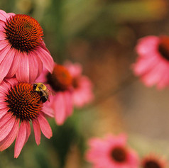
My idea for my summertime update was really just to introduce tones of blush and pink mainly through florals and accents. Now although I've never been a huge fan of the color pink, ironically two of my favorite florals incorporate tones of the color within their petals. How crazy is that?
Yeah, I know, that makes me sound like a walking contradiction perhaps or maybe just a tad bit crazy or weird. Or, perhaps all three! Either way, once I decided I'd incorporate elements of blush and pink into my home through florals, that made executing Summer styling updates all the more easier working with two of my favorite flowers - White Oriental Lillies & Peonies.


By the way...in addition to blush, I'm really feeling black and white patterns right now mixed in with other colors. Or, just hues of black and charcoal amongst more vibrant or brighter colors. The next room, I'll be updating for the Summer is my master bedroom. Stay tuned for how I incorporate black and charcoal amongst all of the bright and warm neutrals in my bedroom. To see it in it's current state, click here and here.


Surprisingly, the introduction of black and white into my living room looks so colorfully divine!! Even amongst all of the blue. However, I couldn't just do solid colors but had to stay true to my love of mixing prints and patterns, even in the most simple way with just a book cover. So black and white stripes with pops of pink it is!
Now ya'll know it wouldn't be me to not infuse my love of mixed metals, or just loads of gold accents into any space. And, since gold is a running theme throughout my home during ALL four seasons...My Summer look no matter what color updates I decided to introduce would have to not only play nice with Blue, but also blend well with gold. And, what color doesn't work well with gold right?!?!?


Speaking of gold, I also updated my kitchen island styling with white Summer florals and these absolutely gorgeous white and gold vases. I'd been eyeing these vases for several months but kept telling myself I didn't need them. Why you ask? Because I have far too many due to my obsession for beautiful pottery.
Since we're being honest here, frankly I have an obsession for all things home decor and have more than my fair share of beautiful accents. But, hey!!! I'm a Designer, what can I say? Or, rather what do you expect from me? To see these beauties each and every time I walk into Niche Modern Home and actually have the strength to walk away from them?!?!? I mean I tried. I really did. But this last time, right before my photo shoot - it wasn't happening!! Nope!!!

See what I mean? Now would you walk away from these beauties over and over again? If your answer is Yes...Well, clearly you have more will-power and strength than me. I happily gave in and brought these beauties home with me. And, guess what? I feel no sort of buyers remorse whatsoever because these vases are far too gorgeous to feel any type of regret. I'm quite happy they're now apart of my vase collection.


Moving along...
While it did cross my mind to add some soft pink throw pillows to my sofas, to further enhance elements of blush into my Summer look...The pull that Blue has on my heart just wouldn't let me do it. But I did however, update my throw pillow lineup by adding in a few new ZGallerie pillows, as well as two monogram throw pillows from Pottery Barn.

The champagne colored and textured Amelie pillows on the right and left side of the art deco or, Mateo blue pillow, originally made its debut into my home for my master bedroom reveal. Oftentimes I'll move items around in my home or repurpose them into another space. This is one of the best and most cost efficient ways to update a space without breaking the bank. And, I absolutely love how the neutral champagne tone looks amongst a sea of blue.
Design Tip: Whenever sprucing up your home or making styling updates, try to repurpose home decor and accents from other rooms into spaces they've never been styled in before. Doing this not only makes a huge impact into your space, but it also cuts down on costs, as well as the need to always purchase new things. In the design world we call it - Shop Your Home.

The addition of the monogram throw pillows provide the Summer brighter and white look I was going for, and I loved that the letter P was threaded in a beautiful neutral taupe shade. This further complimented all of the tones and colors I wanted to bring together for my Summer look...blush, neutrals, mixed metals, bright whites and of course blue! 💙


The final update to my Summer look that really pulled my entire living room together was the gorgeous shadow rug from my dear friend, Farah Merhi's Inspire Me! Home Decor line with QVC.

I can't say enough how much I LOVE this rug!!! Farah clearly designed this bad boy with me and all of the other blue lovers out there in mind. To see images of my former grey hotel bordered rug, please visit my Design Gallery by clicking here. One of the main reasons I decided to change my rug was size. My former rug was much shorter and smaller. However,
I ordered it that way purposely due to the fact that a white border was near the edge of the rug. I desired for the border to show and not hide beneath my sofas. As such, I went smaller than I should've.
Design Tip: General design rule of thumb for installing a rug is to if your space allows, always incorporate a large rug in your living area where at the very least the first two legs of each piece of furniture can rest on the rug. The coffee table alone should be placed in the center of the rug, with the surrounding pieces of furniture built around the table. All surrounding pieces should either fit completely on the rug, or as mentioned the first two legs of furniture resting atop of the rug.


The main reason a larger rug is such an adamant design rule is because it defines the space more and offers much more visual appeal. Only if your space is small and tight can a shorter and smaller rug be visually forgiving. In my case, the border on my former rug was my saving grace. Well, that and the fact that I'm a bit of a design rebel.
I design my home to suit and appeal to both myself and my husband. However, my husband usually just says - "Babe, do whatever you want!" His famous words are - "I just live here!" So essentially, it comes down to what's most visually appealing to me. In the case of my former rug, it was just time to let it go and for once, follow the rules and define my living room space even more.
But by all means, rules are sometimes meant to be broken. So do as you please in your own homes and design your space in a way that makes you most happy.

Although the living room updates for the Summer season were fairly subtle and not super drastic, as there is still tons of blue and will continue to be. As I mentioned above, Blue won't be going ANYWHERE, NO TIME SOON! We're together pretty much forever, in our current home and I'm sure future homes as well.
But I must say, it's so nice to see pops of blush spread throughout my main open floor concept area. And, thankfully Blue seems to be playing quite well with pink. Well, at least for now. Let's see how she feels towards the end of Summer. As I mentioned earlier in this post, the next room I'll be making subtle updates and changes to is my master bedroom. Pops of blush will be added to that space as well, but amongst tones of black, charcoal, greys, whites and neutrals...and of course lots of gold!

I hope you enjoyed my first Summer 2018 blogpost on this very beautiful first day of Summer. In addition, I hope you enjoyed seeing tones of pink and blush spread around my blue living room. And, I hope it inspired you to like me, embrace utilizing the color as well during this Summer season. If you're brand new to my blog and have never been to my shop page, be sure to give that section a visit. On that particular page, I link many of the exact same or similar home decor items from my Instagram feed for you all to purchase.
Many of the photos revealed today in this particular blogpost will appear on my shop page in the coming days. So be sure to check my very own Shop My Likes page frequently to see what home decor items are available for purchase. At current, the very first item that's linked is the gorgeous gold Everglades Metal Tray from ZGallerie (pictured below), which is currently on sale. To view price and make a purchase, click here.


With Love,
Tachic-
"I believe a person's home should be a true reflection and extension of their personal taste and style...with beautiful collected pieces that compliment who they are, what their interests are, and what makes them feel good."
Principal Designer & Proprietor
Tachic Hickman-Piazza

Tachic Hickman-Piazza is a creative in every sense of the word. A professional Filmmaker with an Associate of Science in Film & Video from Full Sail University with fifteen years of experience in the Entertainment Industry. Blogging is a personal and beloved extension of her years spent studying creative writing for television and film.
Yet, Interior Design and all things Home Decor are two of her greatest passions, outside of filmmaking. To learn more about Tachic and her journey into the world of Design, please visit her ABOUT page by clicking here.
To view one of her most ambitious design projects to date where Tachic merged both creative worlds of Filmmaking and Interior Design, all while proudly wearing the mantle of both Designer & Executive Producer, with the release of her House Piazza Home Tour video, click here.
DISCLAIMER: Allured By Design, LLC blog contains some contextual affiliate links and paid sponsorships. An affiliate link means we may receive commission on products sold or clicked links via our site.


Comments