A Very Merry Crimson Christmas!
- Tachic Hickman-Piazza
- Dec 12, 2018
- 11 min read

Updated: Nov 30, 2019
The Holiday Season is in full swing all across the globe, with many having started decking their halls and gotten into the holiday spirit as early as mid October. To my loyal, faithful Day 1's...ya'll know that is far too early and ambitious for me to start holiday decorating. Not just because of my intense schedule, but because I do try and enjoy my Fall Decor for as long as possible. In addition, if some of you remember, I gave a pre-warning at the end of the Summer that my schedule was about to get quite vicious, as at the time, I was in early negotiations to begin Associate Producing a Bravo Network TV Series.
The pre-warning was a courtesy to alert you all that there may be a generous gap in between my last blogpost this past Summer to this most current one. My work schedule is the exact reason, I wasn't able to produce a Fall Decor blogpost for you all. But if you follow me on all of my social media pages, (Instagram & Facebook) then you're caught up to speed at least in photos for how stunning and comfy, cozy my Fall look was this year.
Fast forward to now, we're in the final stretch of wrapping up the show I'm working on, which due to my contract I'm sadly not able to publicly announce prior to the network's big announcement of the series. But for those of you local to NOLA, you all already know because most of the city knows we're filming. The one hint I'll give is...we're filming Season 2 of all things NOLA & Fabulous!!
Amidst of my ever demanding film schedule and juggling a couple of client projects...I somehow found the time to wear myself out, design, stage and style my home, #HousePiazza for the Holidays and do what I always do. Let exhaustion take a back seat and allow both my ambition and passion to deliver my best work and take center stage once again. Last year's Holiday theme was all about the Glitz, the Glam, the Shimmer and Shine, with tones of Champagne, Gold, Silver, Winter Whites, Warm Neutrals and sparkling Christmas Lights taking over me and my Husband's home. (To view last year's look click here.) And, of course there was my favorite primary color Blue amongst all of the shimmery shine.
For those of you who may be brand spankin' new to my website and design blog, Blue and I go together like ornaments on a Christmas tree. I'll probably never own or design a personal home of mine where Blue isn't infused into at least one of my looks, or one of my rooms...and thankfully for me, Blue just so happens to be both me and my Husband's favorite color. So yeah, last year there was the shimmer and shine and of course the Blue. But this year!!! Are ya'll ready for these gorgeous pops of luscious and decadent hues of deep REDS? I'm talking everything Crimson, Ruby, Garnett, and just beautiful traditional pops of Christmas Candy Apple Red. YES!!! Can you believe it? Red has entered #HousePiazza like never before and ya'll know once I commit to a color and a theme, I'm fully committed like none other.
We're going to start my Holiday Tour off a little different than usual and begin in my Master Bedroom and work our way to the main Living Room, the Christmas Tree itself, my Foyer and then onto the Kitchen area. Why the bedroom first you say? Because, thus far, it truly is one of my absolute favorite looks I've ever created in my Master. And, I'm so blown away with how everything, all of the textures, colors and tones came together that it's a must to share this space and start the tour with this room first. So without further ado...
"Welcome to House Piazza's Very Merry Crimson Christmas!"
A Holiday Blogpost & Lookbook filled with Christmas Cheer, Red Lips, Cranberries, Poinsettias, Beauty, Texture, Color, Design, Style and so much more...

Sources:
Interior Design & Styling By: Allured By Design
Creative Director: Tachic Hickman-Piazza
Photography & Photo Stills By: Stacy Marks Photography
Shooting Location: House Piazza
Hair: LaShanda Taylor of Between The Shears
Makeup: Erica Gavin
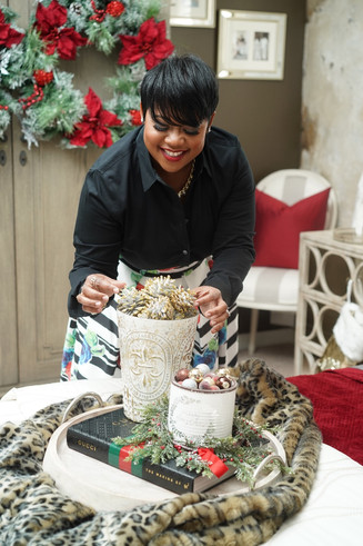
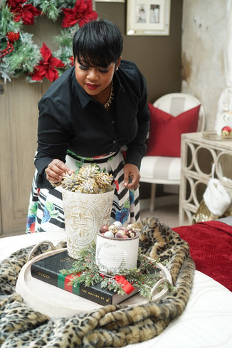
Decor: Safavieh Leopard Throw - BedBath&Beyond, Hurricane & Tray - Pottery Barn, Gucci - Barnes & Noble
Wardrobe: Black Top - Banana Republic, Floral Midi-Skirt - Shop With Tene, Black Booties - Nine West


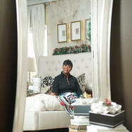
MASTER BEDROOM:
For the past few years, my Husband had been asking me to please design our home in traditional holiday colors for Christmas. I think he was over all of the silver and gold and was longing for a sense of nostalgia during the holiday season. At one time, I actually did stick with more traditional holiday colors but was so ready for a change when we built and moved into our current home...I put the reds to rest for the last few years. Finally, I decided I'd oblige my Husband's request but of course with my own design twist to it by staying true to my love for mixing prints, patterns, textures and various hues altogether for one cohesive look.

Many of you know that I'm a loyal small business shopper that loves to support my favorite local boutiques in my area. However, many of you may also know that one of my all-time favorite large brand Home Decor stores is Pottery Barn. I'd seen this campaign PB shot a few years ago where Crimson Red, Grey and White Marble and Gold was a Holiday theme for a bathroom campaign they designed. I was so in awe of those colors and how amazing they all looked together and was determined to work with that color theme at some point either for myself, or for a client project.
When the holidays rolled around this year, I could not think of a better time to finally incorporate such a beautiful theme. However, the design of my holiday look really came together rather organically, as many of my designs do. While I had visual ideas in mind, nothing was concrete until I started playing around with styling various textures, tones and colors.
I'd purchased these beautiful Grey sheets from Farah Merhi's, Inspire Me! Home Decor line with QVC which are so inexpensive, yet made of such great quality. I knew I'd be switching from my Spring and Summer Ivory sheets to Grey for the Fall and Winter seasons...but wasn't quite sure yet what the full look would be. And, then I saw it...the most gorgeous, decadent and rich Crimson Red quilt set @ Bed, Bath and Beyond, which immediately brought my mind back to the PB campaign from a few years back.


Source:
To purchase my sheets and quilt set...click here and here. To see the full line and collection of Inspire Me! Home Decor with QVC, including sheets in all sizes, click here.
Clearly, that particular campaign was in my memory bank reserve to utilize at a later time. And, as I mentioned...I couldn't think of a better time than this holiday season to finally utilize those colors. I'd also just purchased from Bed, Bath and Beyond for the Fall Season, this gorgeous, plush black leopard print throw manufactured by Safavieh. For my Fall look, the leopard throw was staged and spread across my Blue Living Room sofa. (See my Instagram
feed for visuals.) But for the holidays, I knew the addition of mixing in leopard print with deep hues of Red would be such a winner and just visually appealing.


Now let's get into the beauty of these pillows, shall we?

As many of you know, I love to shop my home and it's highly often a design tip I share with all of my social media followers as well as my blog subscribers. It is absolutely not always a must or a need to go out and buy all new things to spruce up your home. Sometimes, all it really takes is moving things around, rearranging your placement or pulling things from one room into another. Of course, the main key is making sure it all works together to create a refreshed, yet cohesive look.
In the case of my toss pillows, for my holiday look...I wanted this very posh and elegant feel to my Master Bedroom. So I added to my existing pillows two new natural and black toss pillows also from Bed, Bath and Beyond heavily adorned with a velvet appliqué. You can never go wrong with black, and you can hardly ever go wrong with a velvet texture, especially for the holidays.


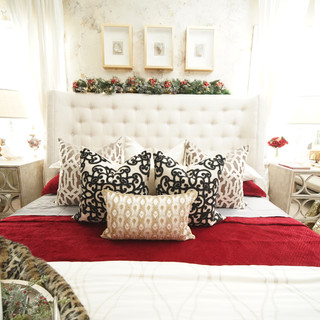


Some of you may remember, I like to refer to me and my Husband's bedroom as our Rustic Regal Retreat. A space that exudes high end elegance and just makes us feel like we've checked into a resort or a hotel. With every new look I create in our Master Bedroom, I'm always going for an extremely visually appealing look, yet that says welcome and simultaneously makes us feel cozy and comfortable.
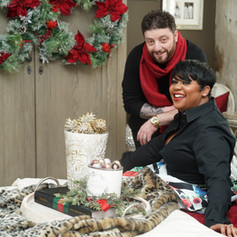
The fact that my Husband is smiling and laughing in some of our Christmas photos lets me know that I possibly did a good job with the Holiday look I created in our Master Bedroom this year. Would you agree?


Additional holiday visuals, photos, and details of our Master Bedroom can be found within the below collage. Simply click on each individual photo to enlarge in a new window.


LIVING ROOM & FOYER:
Ok, so who's still with me? Because we still have rooms to tour :) If I had the luxury of time on my side, I'd separate this blogpost into a Part 1 and 2, possibly even a Part 3. But because I don't...let's just say the design deliciousness in this Merry Crimson Christmas will runneth over in an ambiance of photos. Which I'm sure for many of you that just can't get enough of me and my photographer's work, as well as for those who've been patiently or shall I say eagerly anticipating my Holiday reveal...you're just ecstatic about it, lol. So with that said, let's continue to push through and get into more of this red holiday decadence and yumminess.
My idea and theme for this year's holiday look in my Blue Living Room was inspired by the cover of Valentino: At The Emperor's Table. I mentioned above that my Husband had been longing for me to use traditional reds for the holidays. In our previous home, our living room sofa was Ivory surrounded by beautiful Crimson Red and Black toss pillows. It was much easier to incorporate Christmas reds into that theme. But once I'd committed to blue sofas in our current home, I wasn't too sure how I was going to pull off mixing reds and blues without the mood feeling like 4th of July.

However, once I took a step back and indulged into Valentino's book, let alone the cover...that became the inspiration I needed to pull all of my hues and tones together in an effort to create this cohesive array of holiday colors. Mixing in Blues, Reds, Greens, Golds, Pearl, Silver, Champagne and Winter Whites.

Once more, the idea was for my Master Bedroom holiday look to have a very comfortable, high-end, elegant and posh feel to it. While the rest of our home would feel a bit more festive and fun...Yet still very comfortable and cozy all while maintaining an air of elegant appeal as well.


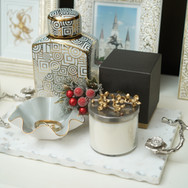
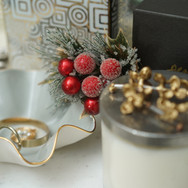
You'll notice there are many continuous accents that appear throughout my home tying in all of my looks. The five main constants spread throughout my home this holiday season are...
Frosted & Sugared Cranberries
Red Poinsettias
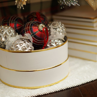
Overflow of Ornaments spilling out of every box, tray and dish
Holiday Potpourri
Plaid & Tartan prints


Holiday Design Tip: As you design and style your own home this holiday season or the next, think about what your continuous thread will be to tie your looks together. While most of us do love the holidays and love bringing on all of the festive holiday decor, it's also very easy to have far too much going on.
As gorgeous as Christmas decor is, a holiday look can also be one of the most overwhelming and challenging looks to execute. Plan ahead, figure out your theme and commit to what your constants will be. Yet, be open to making last minute decor changes if need be. And, if all else fails...hire a Designer that specializes in Designing and Styling Holiday Looks. But most importantly!! Design and Style your home for the holidays in a way that feels and looks good to you and your family.
Additional holiday visuals, photos, and details of our Living Room & Foyer can be found within the below collage. You know the drill...Simply click on each individual photo to enlarge in a new window.


DETAILS OF THE CHRISTMAS TREE:
This year's tree by far is one of the most festive, ornament filled and layered trees I've ever decorated. Because my theme was inspired by Valentino's book cover, which is all about color, opulence and abundance...I interpreted that into the design details of my Christmas tree as well by layering on the golds and mixed metallics. Yet, mixing in loads of reds and blues.


KITCHEN:
Considering my Kitchen and Breakfast Nook sits fairly close to my Blue Living Room, with no separation of walls in between...whatever look I design, create or update in my living area usually always flows over to the kitchen area as well.
Keeping everything consistent with my theme and colors, I moved around some of my existing Gold and White vases and centered them atop of my island...filling them with cranberry stems.


Kitchens can already be busy enough with an abundance of appliances and necessities we need and use on a general basis. So I don't like too much going on or too many accents in my kitchen area. However, for the purpose of this shoot...the goal was to keep everything light, bright and airy yet infusing all of the holiday colors from the living room over into my kitchen area as well. And, I absolutely LOVE how simple, yet festive and elegant the new holiday styling in both my Kitchen and Breakfast Nook turned out.


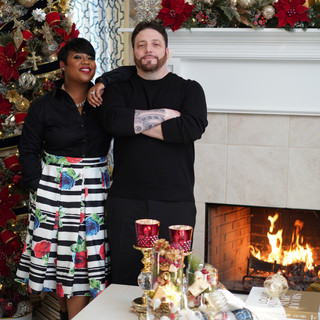
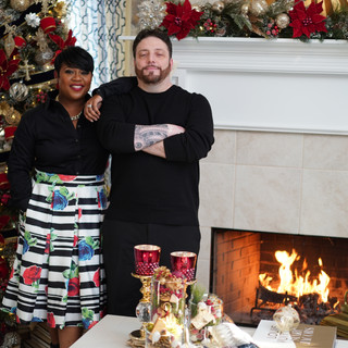
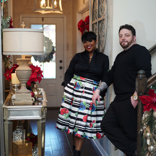
MR. & MRS.PIAZZA:
We are finally at the last stop of #HousePiazza Christmas Holiday Tour 2018. I had all intent to NOT overwhelm you all with a bajillion photos. However, my Photographer, Stacy Marks had other plans and snapped away with reckless abandon!! 😆😫😆 Leaving me with the tiring duty of combing through a million visuals that would ultimately make the cut to share with you all. And, because my Photographer is such a beast at what he does, it was almost impossible to not like just about every photo he captured. Hence the reason, my annual holiday blogpost continues to get bigger and bigger each and every year...ultimately becoming a Christmas Design look book of my work.
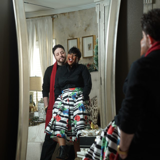
And, with each holiday photo shoot, of course there will always be family photos of me and Mr. Charlie P!


2018 has indeed been a very grueling and challenging year filled with loads of twists and turns and some losses here and there. But it's also been filled with a lot of valuable lessons and many gains as well. I began this year with so much uncertainty, yet knowing that I'd be juggling two very demanding careers and passions...my film career and my growing design career. For as long as I'm able to, I don't ever want to choose one career over the other. And, quite frankly, I don't believe I should have to as each bring me creative fulfillment.
As I love to say..."I'm a Creative Storyteller! I create, weave and tell stories through the medium of Film and Design." That is me. That is who I am. And, as overwhelming and intense as my schedule oftentimes get, I'm so thankful I have my Husband by my side to lean on and be the constant in my hectic and ever evolving creative life. And, also to be apart of my photoshoots even when he really doesn't want to, lol.
May each of you close out this year with a renewed sense of hope and positivity for the incoming year. May peace, prosperity and joy fill your hearts and homes. May old wounds heal, may many of life's issues come to a resolve and may your futures be bright and clear. I hope each and everyone of you have thoroughly enjoyed this year's #HousePiazza Christmas Holiday Tour.
From our home to yours, Happy Holidays!

With Love,
Tachic-
"I believe a person's home should be a true reflection and extension of their personal taste and style...with beautiful collected pieces that compliment who they are, what their interests are, and what makes them feel good."
Principal Designer & Proprietor
Tachic Hickman-Piazza

Tachic Hickman-Piazza is a creative in every sense of the word. A professional Filmmaker with an Associate of Science in Film & Video from Full Sail University with fifteen years of experience in the Entertainment Industry. Blogging is a personal and beloved extension of her years spent studying creative writing for television and film.
Yet, Interior Design and all things Home Decor are two of her greatest passions, outside of Filmmaking. To learn more about Tachic and her journey into the world of Design, please visit her ABOUT page by clicking here.
To view one of her most ambitious design projects to date where Tachic merged both creative worlds of Filmmaking and Interior Design, all while proudly wearing the mantle of both Designer & Executive Producer, with the release of her House Piazza Home Tour video, click here.


Comments