Classic Blue
- Tachic Hickman-Piazza
- Feb 2, 2020
- 6 min read

The Pantone Color of The Year 2020 is none other than Classic Blue. For those of you who know me well and have been following me since the beginning or simply for some time...know all to well I am tried and true to the color blue, as it's my absolute favorite color in the spectrum of all colors in the color universe. So imagine how excited I was when Pantone announced the 2020 color of the year.

Sources + Creative Credits:
Interior Design & Styling: Allured By Design
Creative Direction: Tachic Hickman-Piazza
Design Photography: Stacy Marks
Location: House Piazza
With so many beautiful colors in the world, it made perfect sense for Pantone to choose Classic Blue as the color to begin the new decade. Below Pantone explains why...
Instilling calm, confidence, and connection, this enduring blue hue highlights our desire for a dependable and stable foundation on which to build as we cross the threshold into a new era.
Imprinted in our psyches as a restful color, PANTONE 19-4052 Classic Blue brings a sense of peace and tranquility to the human spirit, offering refuge. Aiding concentration and bringing laser like clarity, Classic Blue re-centers our thoughts and fosters resilience.
Typically when the Christmas holidays are over and the new year begins, we're all for the most part ready for change and new beginnings...be it in our personal lives, professional careers, in our spiritual lives, etc. In the design and home decor world, the top of year is the BEST time to begin clearing out the clutter in our homes. It's also a great time to begin deciphering what new design projects we'll tackle for the year, what fresh looks we'll introduce into our homes (or as I like to say our sanctuaries), and the most fun part of all...what new colors we'll be working with.
Now every household is different including every budget. Some people will definitely break the bank with a multitude of fresh changes for the new year. However, do NOT feel pressured or obligated to do so. Do what will work best for you, your budget and your home. For me personally, I love to get back to the basics once all of the holiday decor is packed away. Seeing my home less cluttered really allows me to enjoy the beauty of my home as is and appreciate the simplicity of a less decorated home.

In general, I'm a more is more kind of girl. However, while I'm not a maximalist, I'm definitely NOT a minimalist at all. I fall somewhere right in the middle appropriately and self-proclaiming myself as a MEDIUMALIST. Yes, I do believe I made up that word, lol. I absolutely loathe clutter, but I also don't care for too much dead or empty spaces either. And, as I mentioned above...the start of the new year is just always such a great time to start fresh in our homes with either new and improved looks, or simply returning back to what's classic, beautiful and comfortable.

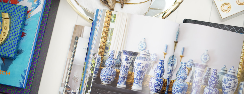
One of my all time favorite design books, which sits on my coffee table all year round is
Aerin Lauder's - Beauty At Home, pictured above and below. This book truly does it for me each and every time, as there's just sooooo much beauty found within the pages of this book. Aerin and I both share a passionate love for the color blue. In addition, we both LOVE pairing blues and whites together accented with gold metallics creating in my opinion one of the most elegant, sophisticated, and yet simple color palettes.


Great design in general is very alluring. Beautiful color palettes are even more alluring. But there's just something to be said, or even more special about the color blue...the beauty of it, the calmness and comfort of it, and how it makes one feel. There's something so reassuring about the color and I think it's one of the main reasons why I love that Pantone titled the color of the year Classic Blue, not teal, aqua, cerulean, celeste, sapphire, royal, cobalt, indigo, navy...which are all colors and hues that I love and appreciate. But, for me and real hardcore lovers of blue...Classic Blue is just where it all begins. It's what's most tried and true and as the name itself says...it's classic and simply never goes out of style.


Ironically, there are sooooo many people that admire the color from afar but are still very afraid to work with blue or introduce it into their homes. I think for many it's a commitment issue. I'm often messaged by many that truly want to work with the color but are fearful that if they commit to such a beautiful, bold color...they'll be stuck with one look and not have as many options to change things up (be it seasonally or annually) as a neutral palette allows them to do.
Here are a few main keys or design tips to working with blue and maximizing all of its potential...
Although a primary color, when committing or introducing blue into your palette...try to work with the color strictly as your neutral. If you change your perspective to viewing the color as a neutral, you'll easily be able to work other colors into your theme.
Blue works well with any and EVERY color in the color wheel. If not your main committed color, it can also be your accent or pop of color that can be just as beautifully styled with any other theme in your home.
Play around with various hues of blue until you find your comfort zone.
As a matter of fact, stay away from committing to just one tone of blue. The more you mix different hues of the color...the more contrast and interest you'll create. Ultimately designing a more custom and visually appealing look.


Many of you know, I change my coffee table styling out seasonally. It's one of the easiest ways to refresh your home without breaking the bank. Oftentimes, I shop my home and repurpose accents and decorative pieces I already own and just restyle them on my coffee table.


At the end of last year for my birthday, which is December 5th...I was invited to my local Tory Burch store by the staff. I'm a huge fan of Tory Burch products, as I own several pieces from her line...ranging from bags, shoes, jewelry and accessories.
I'm also one of the biggest advocates for shopping locally and putting my dollar into physical brick and mortar stores. Doing this ensures that the actual stores will retain their presence and not become a victim of having to shut its doors in our current and highly popular climate of online shopping. Because I frequent my local Tory Burch quite often and have such a great relationship with the staff...I was gifted with the Tory Burch: In Color book, as well as a horse shoe paper weight accent from her home collection. In addition, a signed card from TB herself, which to my knowledge usually goes out to her most loyal customers.


I can't even express the gratitude I felt for the staff, the brand and Tory Burch herself approving one of her stores to gift me with such beautiful and thoughtful gifts. And, I'm sure ya'll already know the tones of blue on the cover of the book and on the horse shoe gift box itself sent me clean over the edge for a second time. Why a second time? Well, I'm so happy you asked. I actually purchased a copy of the book a few years ago. So now I have and own two copies, but one a bit more special than the previous one.
And, I seriously could not wait to display these gorgeous gifts and accents on my coffee table for the 2020 year. I have so many beautiful and inspiring design books. I easily get lost in time combing through all of the pages containing one jaw-dropping and stunning image after another.
My hope for you all in not only this year, but in all future years to come is that like Tory Burch...you all LIVE IN COLOR. And, like Aerin Lauder, you all find the BEAUTY AT HOME in each of your own sanctuaries and are able to enjoy and relish in the designs you create.
In addition, or without a doubt...I also hope more of you will become more comfortable in working with the color blue. Just remember my design tips above and you'll be good to go. However, if blue just isn't your color stay true to whatever feels good and right for you. But as for me and my household, we're good, tried and true to Classic Blue. 💙

Tachic-
XOXOXO
"I believe a person's home should be a true reflection and extension of their personal taste and style...with beautiful collected pieces that compliment who they are, what their interests are, and what makes them feel good."
Principal Designer & Proprietor
Tachic Hickman-Piazza
Tachic Hickman-Piazza is a creative in every sense of the word. A professional Filmmaker with an Associate of Science in Film & Video from Full Sail University with a career spanning the course of sixteen years of experience in the Entertainment Industry. Blogging is a personal and beloved extension of her years spent studying creative writing for television and film.

Yet, Interior Design and all things Home Decor are two of her greatest passions, outside of Filmmaking. To learn more about Tachic and her journey into the world of Design, please visit her ABOUT page by clicking here.
To view one of her most ambitious design projects to date where Tachic merged both creative worlds of Filmmaking and Interior Design, all while proudly wearing the mantle of both Designer & Executive Producer, with the release of her House Piazza Home Tour video, click here.


Comments